Most iOS widget design starts in the wrong place. It asks: what information does this widget surface? How do we make it functional?
We skipped all of that. We asked: would someone actually want to own this?
That one shift changed how we think about everything we make.
Software design has the wrong goals
The usual approach to designing widgets treats them as UI components. Utility first, legibility first, consistency with the OS first.
That gets you fine widgets. Inoffensive ones. The kind nobody ever talks about.
It’s the design equivalent of a white t-shirt from a pharmacy. Covers the requirement. No soul.
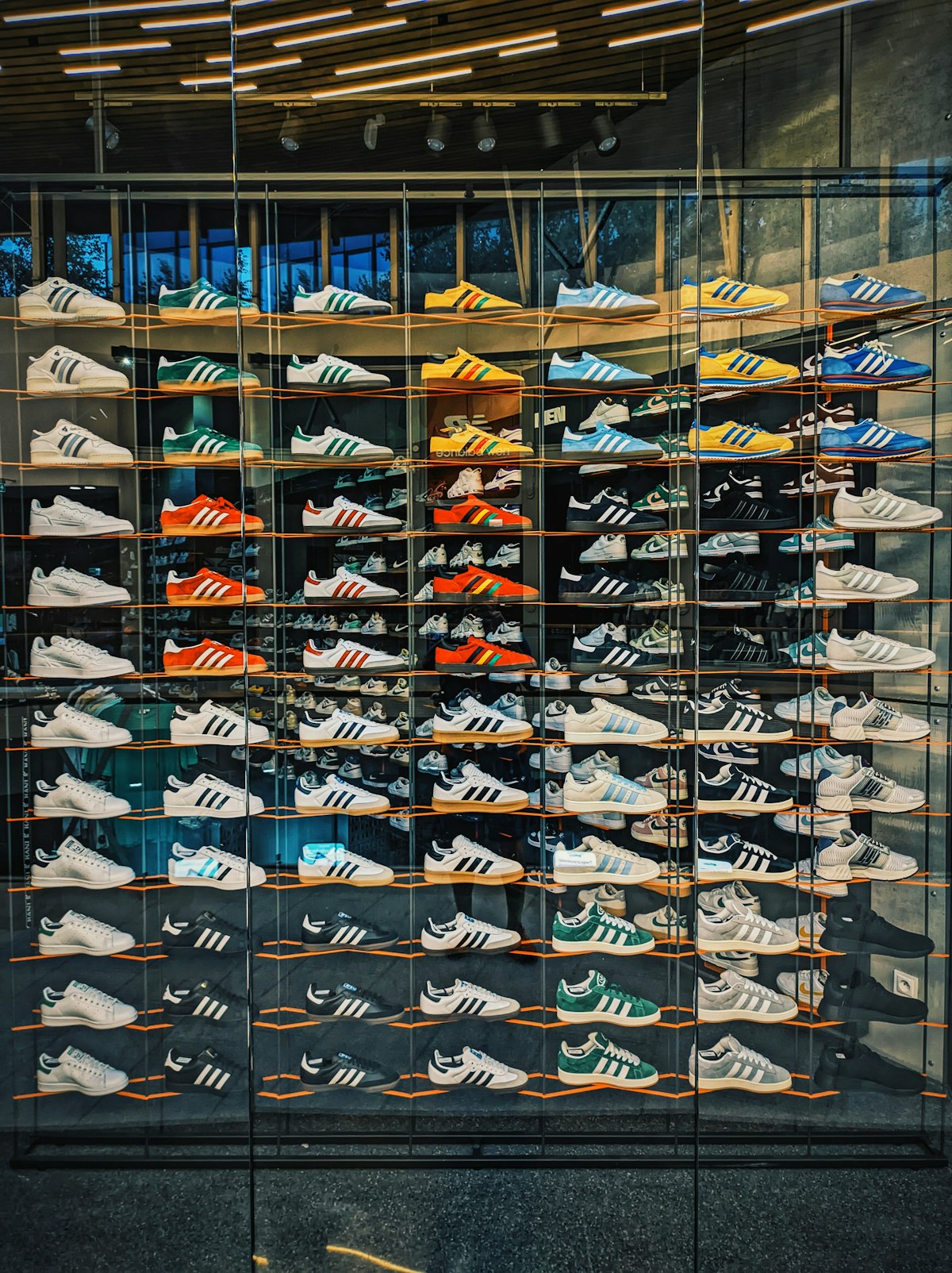
We came at iOS widget design from a totally different direction, borrowed from sneaker culture and toy collecting. These are industries that have spent decades figuring out what makes people desire objects and build identity around them.
What sneaker culture gets right
When Nike drops a limited Air Max colorway, nobody is evaluating it on comfort metrics alone. They’re looking at how it sits on the shelf. How it photographs. Whether it says something about the person wearing it.
That’s desire-driven design. It’s not about function, it’s about wanting.
People like Kaws and Virgil Abloh and the teams behind Bearbrick understood that an object can be worth owning purely because of how it looks and what it represents. Utility is secondary. The cultural signal is what matters.
That’s the exact frame we brought to designing widgets.
A widget is an accessory, not a tool
Your Home Screen is personal. You pick your wallpaper, your app layout, your phone case. Each one says something about taste.
A widget sits at the center of that screen. It’s one of the most visible things on your phone. It deserves to be treated the way you’d treat a watch or a pin on a jacket.
Most widget design ignores this completely. It delivers information. Nobody stopped to think that the person glancing at their phone all day might want something beautiful there. Not just functional. Actually beautiful.
We design every widget at 24QW as a miniature art piece. Each one needs to hold up on its own, as an object worth looking at, regardless of whatever data it happens to display.
The collectible design process
When you approach widget design this way, everything flips.
You stop starting with data hierarchy. You start with visual language. What’s the mood? The reference? Maybe it’s inspired by brutalist architecture. Maybe analog clocks from the 1960s. Maybe underground record sleeves. You sketch it the way a product designer at a fashion house sketches a bag. Aesthetics forward, feel forward.
Then you ask: how does this hold together at small size? Widgets live at thumbnail scale. Making something that reads as deliberate at that size, with those constraints, that’s the real design challenge. Not the data.
You also design with scarcity in mind from the start. When an object is rare, it carries more weight. The blindbox mechanic in 24QW isn’t just a monetization layer. It’s a design consideration. Knowing a widget might be rare changes how we approach its value. Some widgets are meant to be conversation pieces, and the rarer they are, the more that conversation matters.
Limited drops change how people relate to design
Sneaker drops created an entire culture around the moment of release. The anticipation. The reveal. Those are part of the product experience. The object isn’t just the shoe. It’s the story of how you got it.
Toy collectors get this intuitively. A Kaws figure isn’t just a vinyl sculpture. It’s the hunt, the limited run, the fact that not everyone has one.
We’re applying this to widget design for the first time. Each new 24QW widget ships as a drop. You discover it through a blindbox. You don’t know what you’re going to get. That tension is on purpose. It turns a passive Home Screen into an ongoing collection.
Why this matters for the Home Screen
The Home Screen is probably the most personal digital space most people have. And yet it’s remarkably underdesigned. The apps all look like apps. The widgets all look like widgets.
Nobody looked at this space and asked: what if we treated it as designed and collectible? What if your Home Screen could look like a shelf you’re actually proud of?
That’s the question 24QW is built on. Borrow the design thinking of industries that have always understood objects of desire. Ignore the ones that optimize for conversion rates and information density.
Further reading
- 7 Principles for Designing Great Digital-Physical Products — Delve
- New Product Drops Aren’t Just For Sneaker Brands — Built In
- The Art of Sneaker Design — Collection Plate Brand
24QW is available on the App Store. Open a blindbox and see what you get.